Back to featured insights
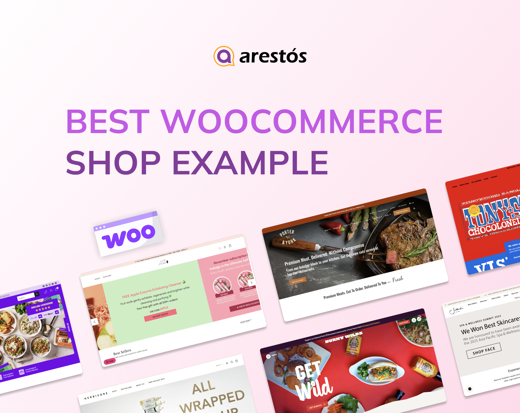
10 Best WooCommerce Shop Examples to Inspire Your Online Store
Discover the best WooCommerce shop examples that showcase modern design, clear layouts, and smooth navigation. These real-world websites will inspire you to create a professional, eye-catching online store that attracts customers and boosts sales. Perfect for beginners and store owners alike.
Table of Content
Share
WooCommerce shop examples are a great source of inspiration for anyone looking to build a high-performing online store. By studying how successful brands design and optimize their WooCommerce websites, you can discover what truly drives engagement and conversions.
Whether you’re a small business owner, an e-commerce designer, or a digital marketer, these examples can help you understand how to create a seamless shopping experience that stands out. In this article, we’ll explore some of the most stunning WooCommerce shop examples and highlight the key lessons you can apply to your own store.
What Makes a WooCommerce Store Successful?
To build a successful WooCommerce store, you need to focus on the key elements that make top-performing shops stand out.
- Clean and Intuitive Layout: A clutter-free design with clear navigation helps visitors quickly find what they’re looking for. Use consistent spacing, clear categories, and a simple header menu to guide customers through your store seamlessly.
- Smooth Shopping Experience: From product search to checkout, every step should feel effortless. Features like a sticky cart, quick view, and guest checkout can reduce friction and improve conversion rates.
- High-Quality Product Images and Descriptions: Great visuals sell products. Use professional images, zoom-in features, and detailed product descriptions that highlight benefits and build trust.
- Fast Loading Speed: Slow websites lose customers. Optimize images, use caching plugins, and choose a reliable hosting provider to ensure your WooCommerce store loads in seconds.
- Mobile-Responsive Design: With over half of eCommerce traffic coming from mobile, your store must look perfect on all devices. Choose themes and layouts that adapt beautifully to smartphones and tablets.
- Clear Call-to-Actions (CTAs): Guide users toward the next step — whether it’s “Add to Cart,” “Buy Now,” or “Learn More.” Use strong, action-oriented language and contrasting button colors.
- Customer Reviews and Social Proof: Displaying reviews, ratings, or testimonials helps build credibility. Consider adding a WooCommerce review plugin to encourage and showcase authentic feedback.
- Easy Product Filtering and Search: Make browsing simple with smart filters by category, size, or price. A well-optimized search bar with instant suggestions improves user experience dramatically.
- Personalization & Recommendations: Suggest related products or “customers also bought” sections to increase average order value and enhance the customer journey.
- Secure and Seamless Checkout: A trustworthy checkout process is essential. Use SSL certificates, multiple payment options, and clear progress indicators to make checkout fast and secure.
Top 10 WooCommerce Shop Examples to Inspire Your Online Store
Here are ten stunning WooCommerce shop examples that showcase how great design and functionality can elevate your online store.
5 Best WooCommerce Store Examples for Beauty Products
Kiki & Green
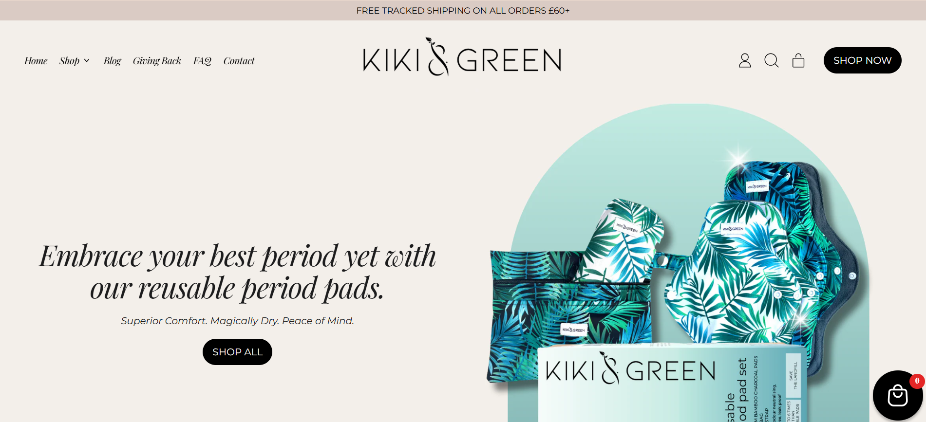
- Website: https://kikiandgreen.com/?variant=46512448012606
- Main Products: Eco-friendly home goods, reusable bottles, sustainable lifestyle accessories
- Traffic: 42.3K/month
- Ranking: 118,742 (US) & 588,923 (Global)
Kiki & Green embraces sustainability and modern design to deliver eco-friendly products that fit seamlessly into everyday life. By leveraging WooCommerce, the brand provides a smooth and visually engaging shopping experience that reflects its commitment to environmental responsibility.
Founded with a mission to promote sustainable living, Kiki & Green focuses on products that combine functionality with eco-conscious materials. Their WooCommerce store highlights clean visuals, intuitive navigation, and a consistent green aesthetic that resonates with environmentally aware consumers.
Herbivore Botanicals
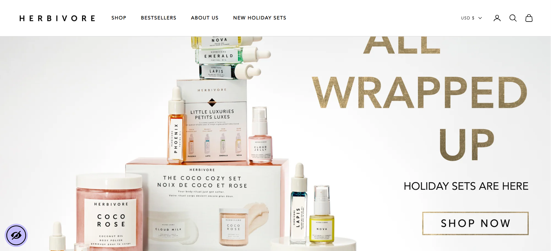
- Website: https://www.herbivorebotanicals.com/
- Main Products: Natural skincare, facial oils, body scrubs, and wellness products
- Traffic: 357.8K/month
- Ranking: 22,463 (US) & 118,742 (Global)
Herbivore Botanicals is a clean beauty brand that blends natural ingredients with minimalist design to create luxurious skincare products. Using WooCommerce, the brand delivers a seamless shopping experience that mirrors its modern, eco-conscious aesthetic.
Founded in Seattle, Herbivore Botanicals stands out for its commitment to sustainability and transparency. Each product is made with ethically sourced ingredients and packaged in recyclable materials. Their WooCommerce store features elegant visuals, soft pastel tones, and a calm shopping flow — perfectly aligned with the brand’s vision of “safe beauty for all.”
100% Pure
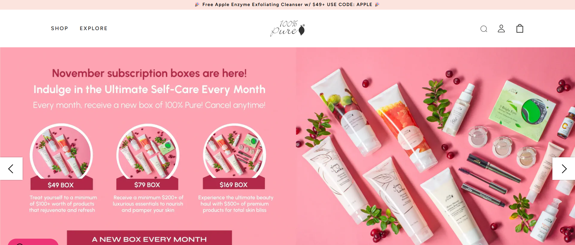
- Website: https://www.100percentpure.com/
- Main Products: Natural makeup, skincare, hair care, and body products
- Traffic: 519.6K/month
- Ranking: 15,812 (US) & 79,623 (Global)
100% Pure is a pioneering clean beauty brand dedicated to producing natural, cruelty-free cosmetics and skincare products. By using WooCommerce, the company ensures a smooth and personalized online shopping experience that matches its philosophy of purity and sustainability.
Founded in 2005, 100% Pure stands out in the beauty industry for its commitment to using only natural, non-toxic ingredients derived from plants, fruits, and vegetables. The brand’s WooCommerce-powered website reflects its bright and refreshing identity — with pastel tones, high-quality imagery, and a user-friendly interface that encourages conscious beauty choices.
Love Lula
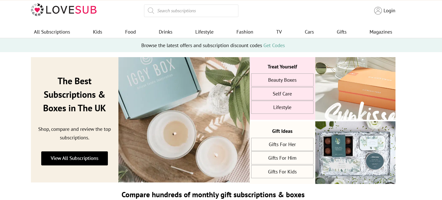
- Website: https://lovesub.co.uk/
- Main Products: Organic skincare, makeup, hair care, and body products
- Traffic: 61.7K/month
- Ranking: 96,841 (UK) & 433,294 (Global)
Love Lula is a UK-based beauty retailer specializing in natural and organic skincare and cosmetics. With WooCommerce, the brand delivers a seamless, trust-driven online shopping experience that emphasizes clean beauty and product authenticity.
Love Lula has become one of the UK’s most recognized platforms for ethical and eco-conscious beauty. Their WooCommerce-powered store features a minimalist design with soft color palettes and intuitive navigation, making it easy for customers to explore a wide range of clean beauty brands while supporting sustainability and transparency in cosmetics.
Sodashi
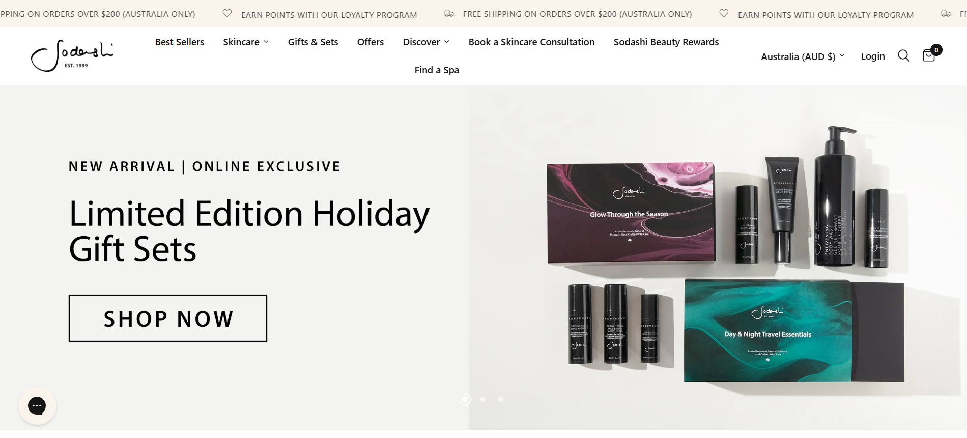
- Website: https://www.sodashi.com/
- Main Products: Natural skincare, facial treatments, body care, and wellness products
- Traffic: 28.4K/month
- Ranking: 152,947 (US) & 694,318 (Global)
Sodashi is a luxury skincare brand from Australia that focuses on holistic beauty and natural wellness. By utilizing WooCommerce, Sodashi delivers an elegant, intuitive online store that reflects its commitment to purity, quality, and mindful self-care.
Founded in 1999, Sodashi combines advanced skincare science with the power of natural ingredients to create products that nourish both the skin and the spirit. Their WooCommerce website embodies minimalism and calm luxury — using soft tones, clean layouts, and an effortless shopping flow that resonates with customers seeking a natural yet premium skincare experience.
If you’re looking for inspiration in the health and beauty niche, check out our article on 5 WooCommerce Shop Demos for Your Health and Beauty Business
5 Best WooCommerce Store Examples for Food Products
Tony’s Chocolonely
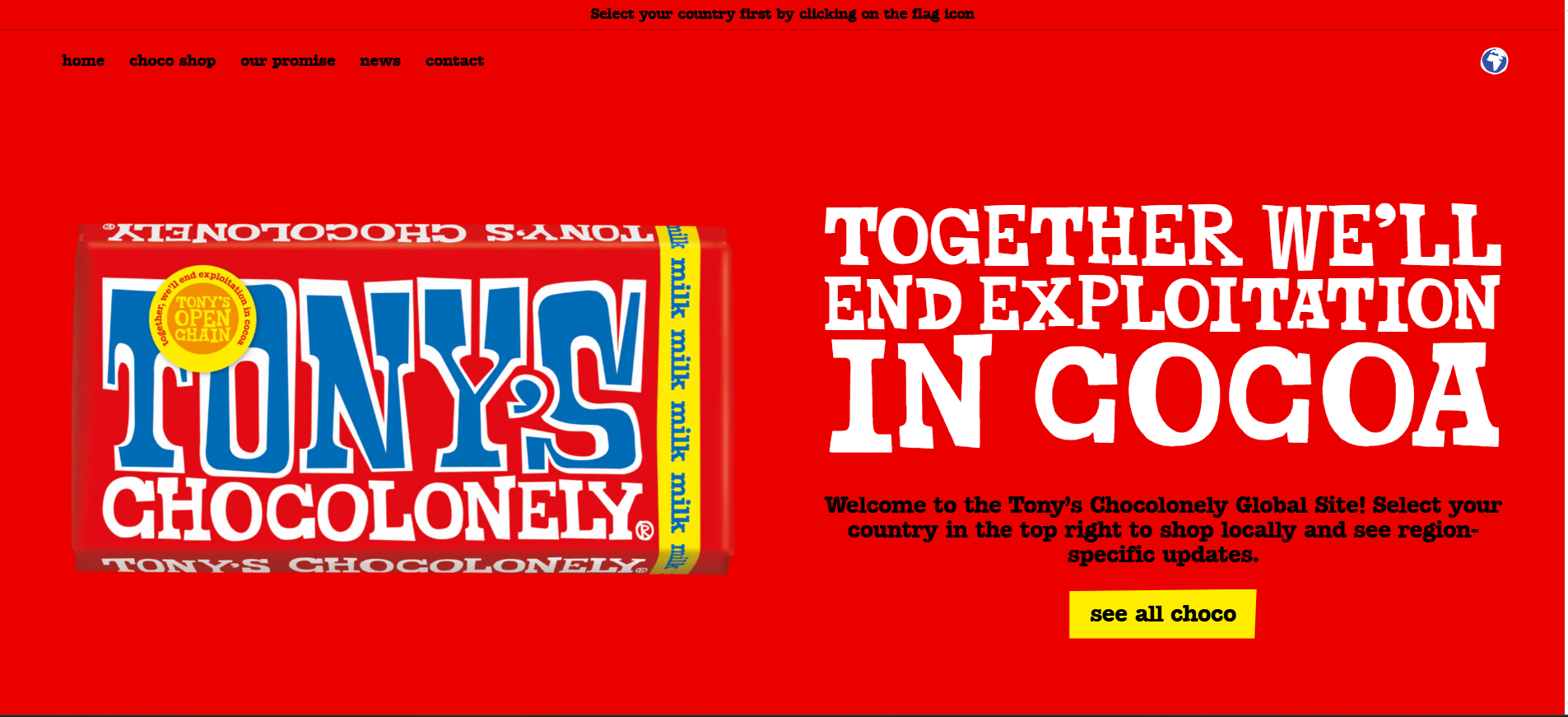
- Website: https://tonyschocolonely.com/
- Main Products: Fair trade chocolate bars, gift boxes, and sustainable cocoa products
- Traffic: 493.2K/month
- Ranking: 14,932 (Netherlands) & 84,506 (Global)
Tony’s Chocolonely is a Dutch chocolate brand on a mission to make the chocolate industry 100% slave-free. By leveraging WooCommerce, Tony’s offers a playful and engaging online store that reflects its strong ethical stance and bold personality.
Founded in 2005, Tony’s Chocolonely has revolutionized the chocolate market by prioritizing transparency and fair trade practices. Their WooCommerce-powered website perfectly captures the brand’s fun and colorful identity — featuring bright visuals, storytelling-driven layouts, and a seamless checkout experience that encourages customers to support ethical chocolate consumption.
Porter & York
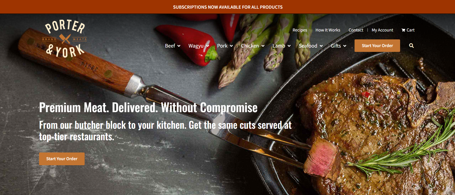
- Website: https://porterandyork.com/
- Main Products: Fresh beef, pork, poultry, seafood, and gourmet cuts
- Traffic: 176.5K/month
- Ranking: 38,942 (US) & 204,318 (Global)
Porter & York is a premium online butcher shop that delivers fresh, never-frozen meats directly to customers’ doors. Using WooCommerce, the brand provides a clean, reliable, and user-friendly platform that makes high-quality meat shopping convenient and transparent.
Founded in the Pacific Northwest, Porter & York has built its reputation on freshness and craftsmanship. Their WooCommerce-powered website highlights stunning food photography, detailed product descriptions, and clear sourcing information — ensuring customers know exactly where their food comes from. The overall experience reflects the brand’s dedication to premium quality and exceptional customer service.
Dineamic
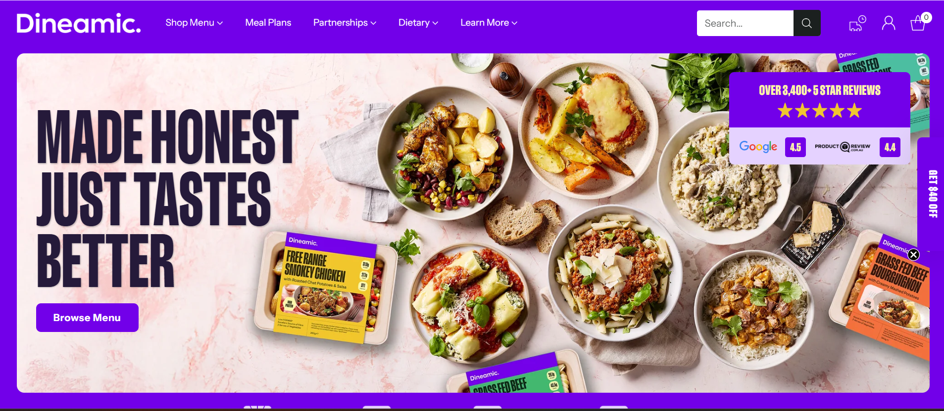
- Website: https://www.dineamic.com.au/
- Main Products: Fresh meals, salads, vegetarian dishes, gluten-free options, and meal plans (high-protein, low-carb)
- Traffic: 58.2K/month
- Rank: 49,532 (Australia) & 517,204 (Global)
Dineamic is a healthy meal brand from Australia that specializes in fresh, nutritionally balanced, and convenient meals prepared by professional chefs and delivered straight to customers’ doors. With WooCommerce, the brand has built a modern, user-friendly online store that makes ordering fresh meals quick, personalized, and reliable.
Founded in Melbourne, Dineamic aims to help busy people maintain a healthy diet every day. Its WooCommerce-powered website stands out with a bright design, appetizing food photography, and a smooth ordering process. Dineamic also offers customizable meal plans based on dietary preferences, reflecting its strong commitment to health, convenience, and customer satisfaction.
Daelmans Stroopwafels
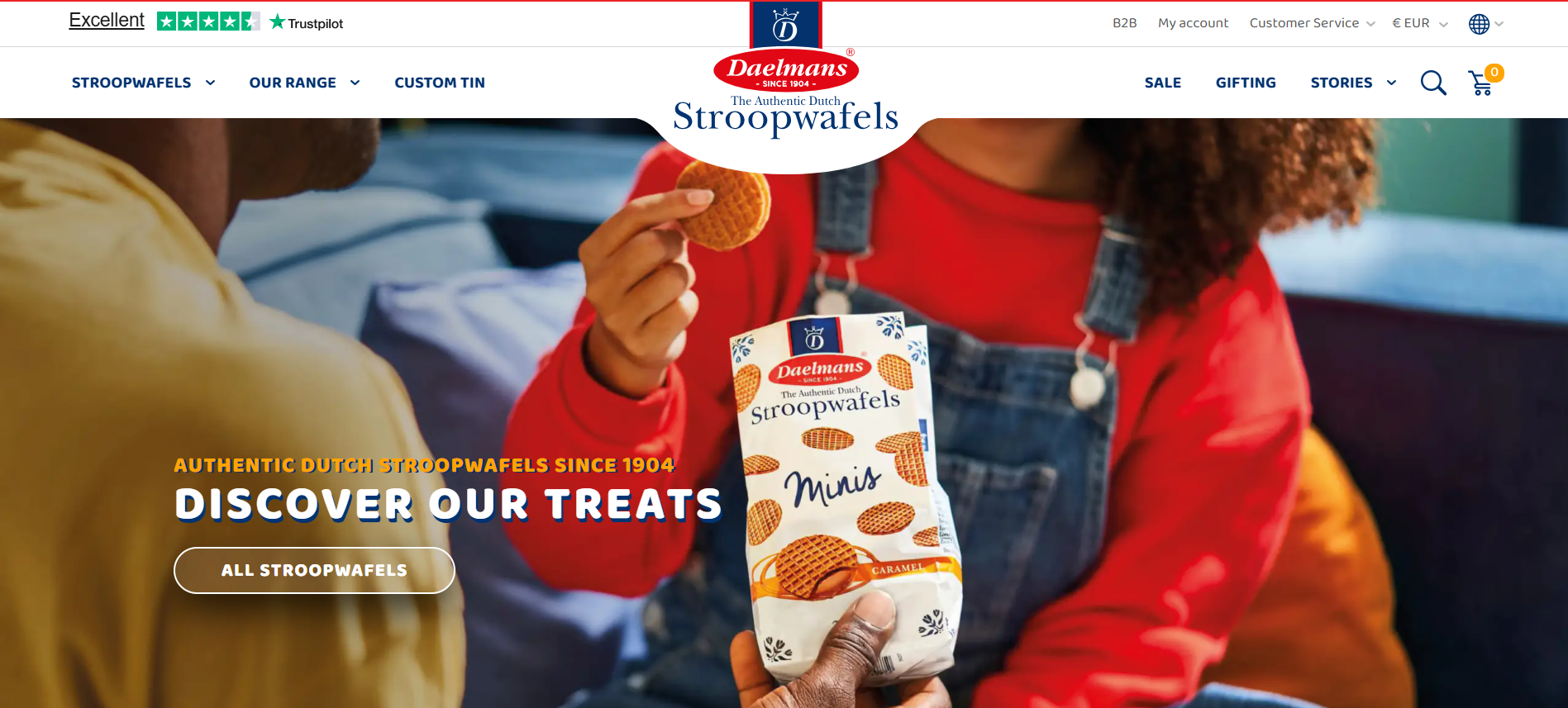
- Website: https://www.stroopwafels.com/
- Main Products: Caramel, honey & chocolate-caramel stroopwafels (various sizes: Jumbo, Large, Mini)
- Traffic: Approx. 32.5 K visits per month
- Ranking: Digital rank ~1,272,137 globally according to EcommAnalyze
Daelmans Stroopwafels is a Dutch heritage cookie brand known for its caramel-filled stroopwafels, and it leverages WooCommerce to bring these treats to shoppers worldwide via an elegant online store.
Founded in the Netherlands over a century ago, Daelmans Stroopwafels has expanded from a local bakery into an internationally recognized brand. Their WooCommerce-powered website stands out by offering high-quality product photography, multiple packaging formats (including customizable tins), and an emphasis on authentic Dutch craft. The online store amplifies its mission of bringing this classic treat to a global audience, backed by strong distribution channels and a commitment to ingredient quality (no artificial flavours, no trans-fats).
Burny Wild’s
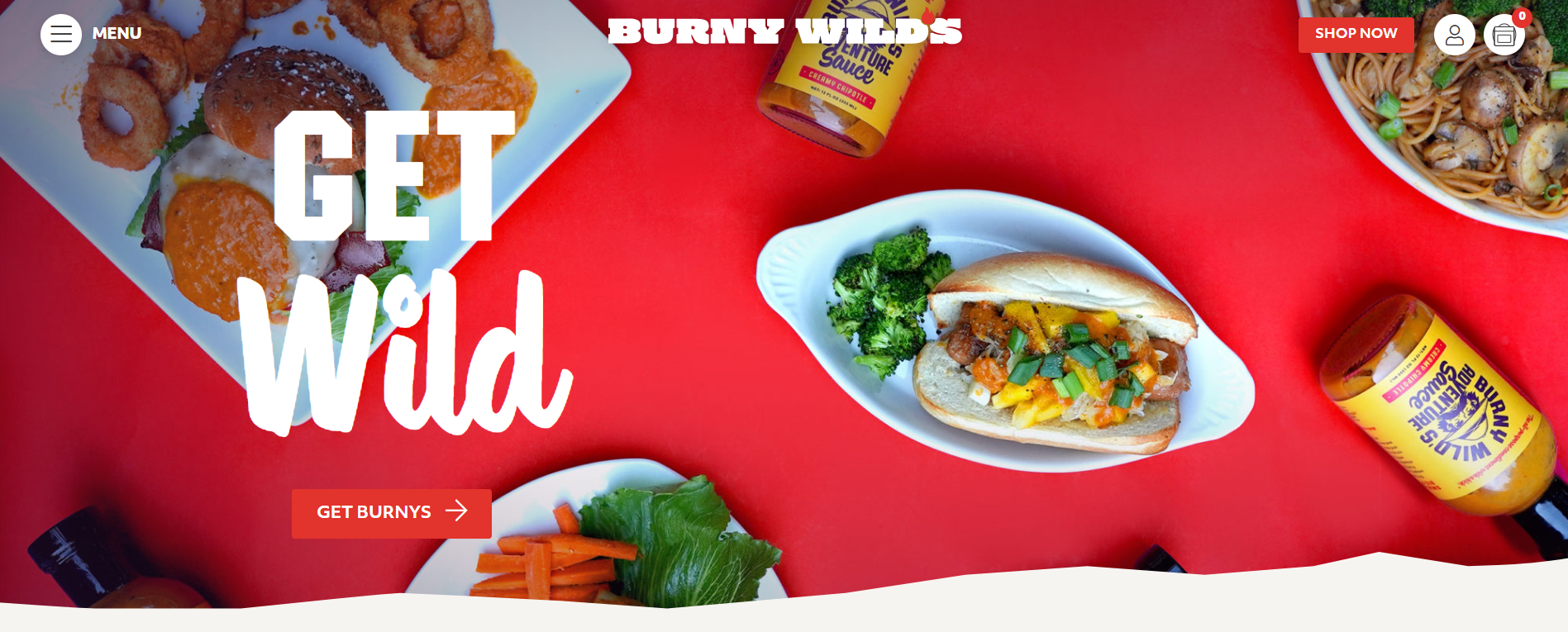
- Website: https://burnywilds.com/
- Main Products: Vegan & gluten-free sauces, natural condiments, branded apparel & accessories
- Traffic: 65.2K/month
- Ranking: 129,784 (US) & 512,392 (Global)
Burny Wild’s is a plant-based condiment brand from Raleigh, North Carolina, known for its “heat with heart” philosophy — bold flavors made with care for the planet. Powered by WooCommerce, their website delivers an adventurous, intuitive, and visually engaging shopping experience that perfectly mirrors their brand identity.
Burny Wild’s website captivates visitors with bold visuals, vibrant colors, and interactive storytelling built on WooCommerce. The design reflects the brand’s adventurous spirit while ensuring easy navigation and smooth purchasing. It also highlights sustainability values (eco-friendly packaging, 1% for the Planet partnership) and natural ingredients, strengthening their identity as a responsible and inspiring modern food brand.
Once you’ve explored these WooCommerce examples, the next step is to customize your own shop layout. To learn how, check out our full guide — How To Customize a WooCommerce Shop Page Template: The Complete Guide
Key Takeaways from These WooCommerce Examples
Even though each brand has its own identity, these WooCommerce stores share a few key principles that make them successful and inspiring.
- Focus on User Experience (UX): Clean layouts, intuitive navigation, and fast loading speeds make shopping effortless and enjoyable.
- High-Quality Visuals: Stunning product photos and consistent branding across the site build trust and emotional connection.
- Strong Brand Storytelling: Each store uses WooCommerce not just to sell, but to share its story — values, mission, and lifestyle.
- Mobile Optimization: A seamless mobile experience is essential, as most customers browse and shop on smartphones.
- Trust and Transparency: Clear product details, easy returns, and visible sustainability efforts enhance customer confidence.
- WooCommerce Flexibility: These examples highlight WooCommerce’s power to adapt — from small artisan brands to global eCommerce names.
For those targeting customers in Hong Kong and looking for localized store designs, check out our curated list of Top 10 WooCommerce Shop Templates for Hong Kong Online Stores
Frequently Asked Questions
1. What makes a WooCommerce store successful?
A successful WooCommerce store combines great design, smooth user experience, fast performance, and clear branding. The best stores also use high-quality visuals, strong storytelling, and reliable functionality to build trust and boost sales.
2. Can I build a WooCommerce store without coding?
Yes! WooCommerce is beginner-friendly. You can build a professional-looking store using pre-designed themes, drag-and-drop builders like Elementor, and WooCommerce plugins — no coding required.
3. Which WooCommerce themes are best for creating a stylish store?
Some of the top-rated WooCommerce themes include Astra, OceanWP, Storefront, and Flatsome. These themes are lightweight, customizable, and optimized for both speed and SEO.
4. How can I improve my WooCommerce store’s performance?
Use a reliable hosting provider, optimize your images, install a caching plugin, and minimize unnecessary plugins. Regular updates and database cleanups also keep your store running fast.
Conclusion
The WooCommerce shop examples we’ve explored show how creativity, storytelling, and smart design can transform an online store into a powerful brand experience. Whether it’s stunning visuals, smooth navigation, or authentic brand values, each store proves that WooCommerce offers endless possibilities for businesses of all sizes to grow and stand out in the e-commerce space.
At Arestós, we specialize in building high-performing WooCommerce websites that blend functionality with aesthetics. Our team helps you design, customize, and optimize your store to deliver a seamless user experience that drives sales and strengthens your brand identity.
Contact us today to turn your vision into a beautiful, conversion-focused online shop.
Subscribe to our newsletter!
Get updated to
the lastest IT trends
Related Posts
Update the latest technology trends for your business


