The Top WooCommerce Themes for Mobile-Friendly Online Stores 2024
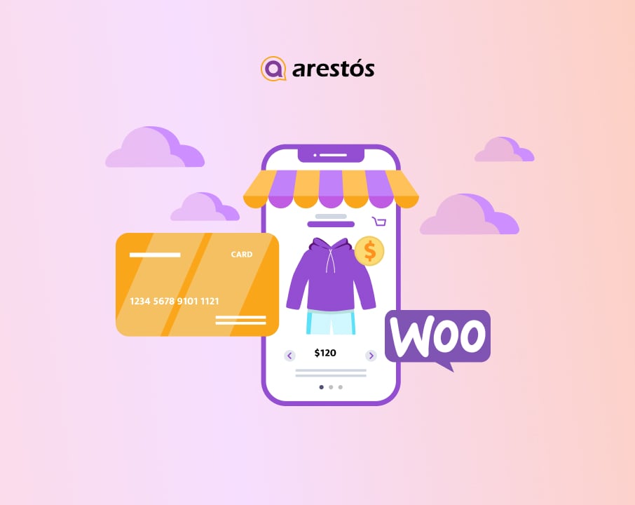
In today's digital landscape, having a mobile-friendly online store is crucial for success. With the increasing number of people shopping on their mobile devices, it's essential to ensure that your WooCommerce store is optimized for mobile users. One of the key elements in creating a mobile-friendly store is choosing the right WooCommerce theme.
About the Author: Thanh Huyen
December 12, 2023
In today’s digital landscape, having a mobile-friendly online store is crucial for success. With the increasing number of people shopping on their mobile devices, it’s essential to ensure that your WooCommerce store is optimized for mobile users. One of the key elements in creating a mobile-friendly store is choosing the right WooCommerce theme. In this blog post of Arestós, we will explore the top WooCommerce themes that excel in mobile optimization, helping you create a stunning and user-friendly mobile shopping experience.
Benefits of Mobile-Friendly Online Stores:
Before diving into the top WooCommerce themes, let’s understand the benefits of having a mobile-friendly online store.
Enhanced User Experience:
Mobile-friendly online stores provide a seamless and intuitive user experience for mobile shoppers. With a responsive design that adjusts to different screen sizes, customers can easily navigate through your store, view products, and complete purchases. Mobile-optimized features such as touch-friendly elements and simplified checkout processes make it effortless for customers to interact with your store, leading to higher customer satisfaction and increased likelihood of repeat purchases.
Woocommerce themes have improved search engine rankings:
Search engines, like Google, prioritize mobile-friendly websites in their search results. Having a mobile-friendly online store can positively impact your search engine rankings, helping you reach a wider audience and attract more organic traffic. By implementing a mobile-friendly WooCommerce theme, you are more likely to rank higher in mobile search results, increasing your store’s visibility and generating more organic traffic and potential customers.
Increased Conversion Rates and Sales:
A mobile-friendly online store can significantly impact your conversion rates and sales. With more people shopping on their mobile devices, providing a seamless and optimized mobile experience can lead to higher conversion rates. Mobile-friendly themes ensure that your product pages load quickly and display properly, reducing the chances of customers abandoning their carts due to slow or clunky mobile experiences. By making it easy and convenient for customers to make purchases on their mobile devices, you can drive more sales and maximize your revenue potential.
Access to a Growing Mobile Market:
The number of mobile users worldwide continues to grow rapidly. By having a mobile-friendly online store, you tap into this vast market of potential customers. Mobile shoppers are often looking for convenience and instant access to products and services. By catering to their needs with a mobile-optimized store, you can capture a larger share of the mobile market and stay ahead of your competitors.
Better Customer Engagement and Retention:
Mobile-friendly online stores provide opportunities for enhanced customer engagement and retention. With features like push notifications, mobile-exclusive offers, and personalized recommendations, you can keep your customers engaged and encourage repeat purchases. Mobile-friendly themes also allow you to leverage social media integrations, enabling customers to easily share your products and promotions with their networks, expanding your brand reach and attracting new customers.
Woocommerce themes have the adaptability to change consumer behavior:
Consumer behavior and preferences are constantly evolving, and mobile shopping is a significant part of this evolution. By embracing mobile-friendly online stores, you demonstrate your adaptability to changing consumer trends and preferences. This flexibility positions your brand as modern and customer-centric, instilling trust and loyalty among your mobile-savvy audience.
Key Factors to Consider for Mobile-Friendly WooCommerce Themes:
When selecting a WooCommerce theme for your mobile-friendly store, there are a few key factors to consider:
Responsive design should be considered for mobile-friendly WooCommerce themes.
Choose a theme that offers a responsive design. Responsive design ensures that your store adapts and displays properly on different devices and screen sizes, providing a seamless shopping experience for mobile users.
Mobile-Optimized Features:
Look for themes that offer mobile-optimized features such as mobile navigation, touch-friendly elements, and quick load times. These features enhance the usability of your store on mobile devices, making it easier for customers to browse and purchase products.
Compatibility with Mobile Devices and Browsers:
Ensure that the theme is compatible with a wide range of mobile devices and browsers. Test the theme extensively on different devices and browsers to ensure a consistent and flawless experience for mobile users.
Top WooCommerce Themes for Mobile-Friendly Online Stores:
Now let’s explore some of the top WooCommerce themes that excel in mobile optimization:
ZITA is WooCommerce Themes for Mobile-Friendly Online Stores:
Zita is a multipurpose WordPress theme that is fast, lightweight, and powerful, with responsive and mobile-friendly layouts.
This theme includes 50+ pre-built templates for various niches, including WooCommerce, which can be imported with a single click.
This theme gives you complete control over the container, allowing you to customize the website structure to your liking. It has several header and footer options, blog layouts, and several WooCommerce features that improve the shopping experience for customers.
Zita works with all of the popular page builder plugins, including Elementor, Brizy, Visual Composer, and others. Without coding knowledge, you can customize each element of your website.
Top Store
Top Store is a feature-rich and powerful mobile-friendly WordPress theme created specifically for eCommerce stores.
The theme includes a variety of features, including header and footer layouts, ajax live search, several sections with reordering, slider layouts, eight different widgets, an off-canvas sidebar, a sticky header, and more.
The theme includes several online store templates that can be customized using the live customizer to change the color, logo, background, content, and more.
This WooCommerce theme is fully responsive and mobile-friendly, ensuring that your website looks great on all devices. Its SEO-friendly code will help your website rank higher in search engines.
Astra
Astra is one of the most popular mobile-friendly WooCommerce themes out there. Its flexible and responsive design adapts to all screen sizes.
It is fully compatible with all the famous page builders, including Gutenberg, Elementor, Beaver Builder, and more. You can quickly create custom pages with its drag-and-drop functionality.
You can easily customize the header and footer, adjust typography, change the color, logo, and more for mobile devices. Astra ensures your website performs well on any device.
It is lightweight, SEO-friendly, and optimized for speed with full WooCommerce support.
Considerations for Choosing the Right Mobile-Friendly WooCommerce Theme:
When selecting a WooCommerce theme for your mobile-friendly store, keep the following considerations in mind:
Brand Alignment:
Choose a theme that aligns with your brand identity and target audience. Consider the visual style, color schemes, and overall aesthetics to ensure consistency with your brand image.
Ease of Customization:
Look for themes that offer easy customization options, allowing you to tailor the design and layout to your specific requirements. This flexibility ensures that your store reflects your unique brand personality.
Support and Documentation:
Check for themes that come with reliable support and comprehensive documentation. This ensures that you have assistance available in case of any issues or questions during the setup and customization process.
Conclusion:
Creating a mobile-friendly online store is essential for success in today’s mobile-driven world. By choosing the right WooCommerce theme, you can provide a seamless and engaging shopping experience for your mobile users. Consider the top WooCommerce themes mentioned in this blog post, ensuring they offer responsive design, mobile-optimized features, and compatibility with various devices and browsers. By optimizing your store for mobile, you can attract and retain more customers, leading to increased conversion rates and sales. Take the next step towards mobile success by selecting the perfect WooCommerce theme for your online store.
Remember, your WooCommerce theme plays a crucial role in mobile optimization, so make sure to carefully evaluate and choose the one that best suits your store’s needs. If you want to consult or design a website, get in touch with our woocommerce experts today at Arestós.

Related Posts
Update the latest technology trends for your business
Related Posts

